Project description
Build your very own Tenochtitlan in this Aztec-inspired citybuilder. This project was made for, and in collaboration with, 3Museos. The national museum of Mexico.
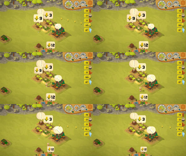
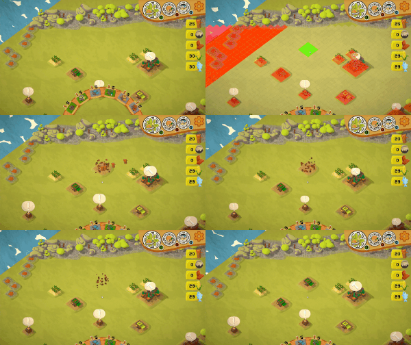
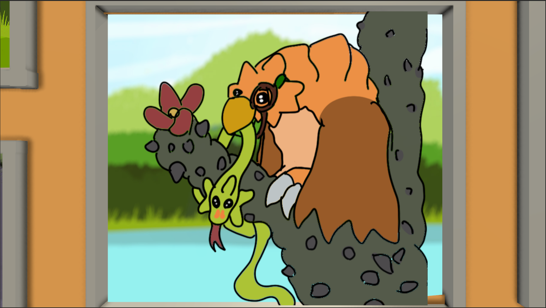
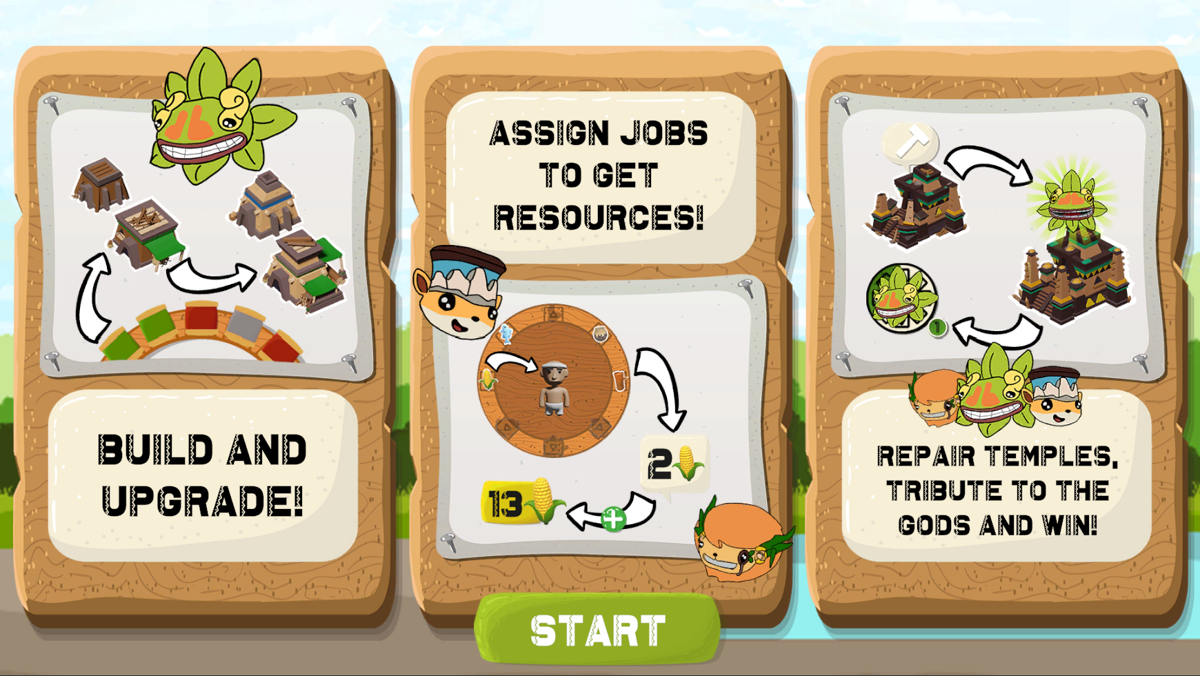
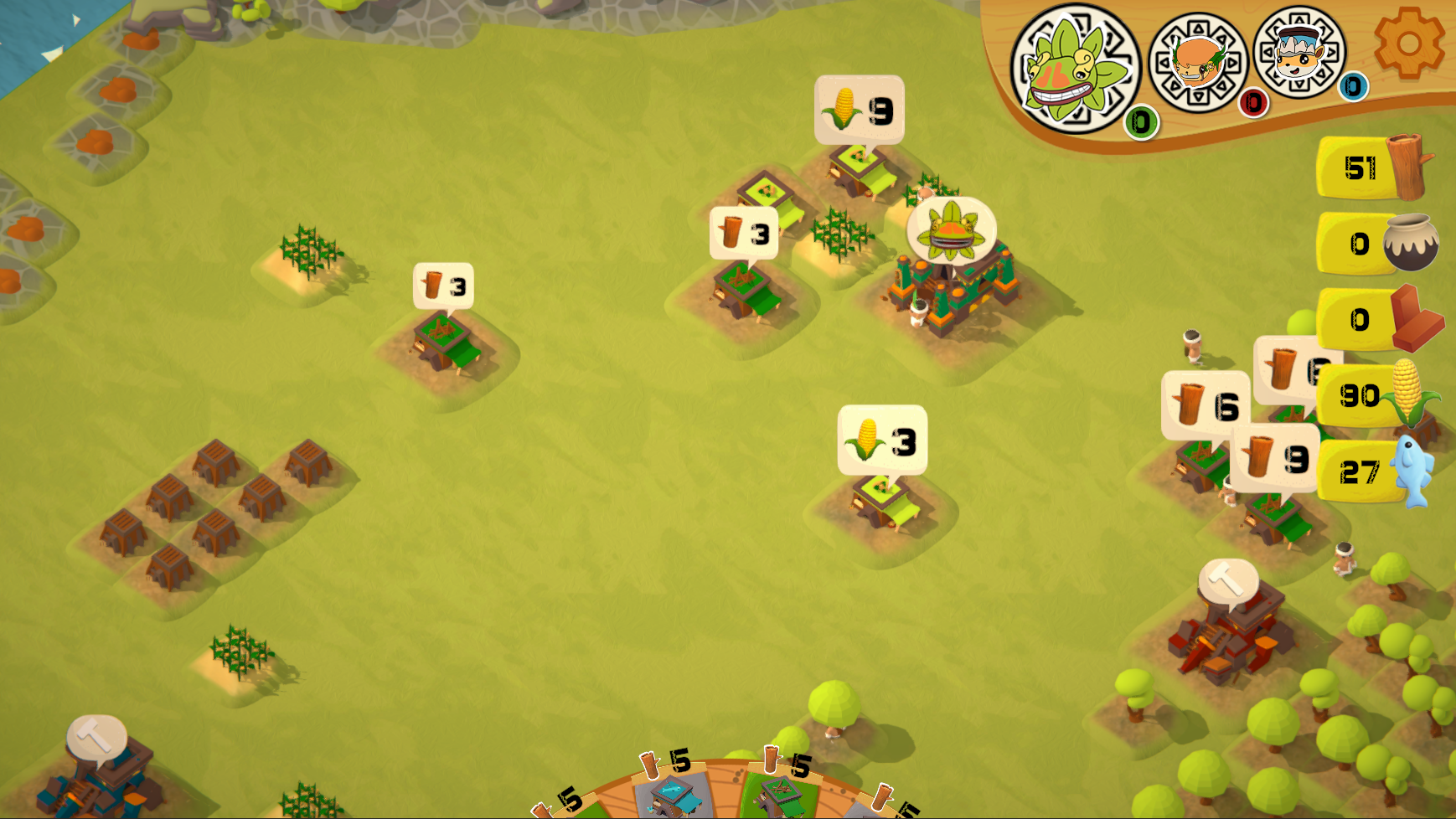
In this game, you build your own city from the ground up by assigning villagers to jobs that produce resources. These resources are realistic to the resources they used back in those times. You can progress by tributing to the gods, where you unlock new tiers of buildings. During your play, you’ll get to see comics describing the history and myths of the Aztec people.
This project was made for the Applied Games course of the Independent Game Production bachelor, where we focus on working in a group to create a serious (educational) game. I’m pleased to say that our client was very happy with the end product of our game, and will be presented during certain times on display within their museums. Please visit the link here: https://www.3museos.com/videojuegos/
My contribution
This project was made with Ben Vanhaelst, Vital De Wachter, Fae Muylle and Michiel De Paepe over the course of one semester, in which we went through 3 stages; brainstorming, production and polish. This made it quite the sizable project. These are some of the general takeaways.
- Communication: What became the biggest take away from this project was communication, both between teammates and towards our client. To make sure everyone is on the same page, it is incredibly important to constantly keep each other updated. By doing so, you limit double work from happening so that less time is wasted.
- Planning: This was the first project where we were introduced to HacknPlan, a tool that would soon become vital to my planning systems.
- Documentation: During this project, I soon came to learn that I really enjoy writing out the various documents required during production, such as the GDD, Art Bible and making the meeting reports.
During the project, we all shared the task of designing the game. While Vital De Wachter was the main Game Designer, we each brainstormed together to ensure that we had a nice finished game project by the end of it.
Our client wanted one of three possible options for their submission, a game surrounding the Aztec clothing, a game around building an Aztec city, or a game about tributing to Aztec gods. After brainstorming multiple options, we ended up going for an ambitious project that collaborated all three. While the base game still had a lot of changes made (mostly in favor of scope) throughout it’s progression, that core value still remained.
During the progression of the project, I mainly learned how to effectively build system streams, making use of Machinations to create a visual representation of what the project’s resource flows would be, which turned out to be quite enjoyable to do. Throughout production, it became evident to make sure that everyone was up to date with the planned resource streams, but to also not be too rigid on it. This way, creating a nice resource flow is a two ways street, in parts enforcing design choices, and in parts being influenced by design choices. We did this to reach the biggest fun factor we could, as the player experience is much more important than the exact correctness of resource flows.
For this, I quite enjoyed learning about Machinations, and see big potential in it’s future as a way to easily visualize flows and systems in and outside of games. It’s easy to follow tutorials and extensive documentations helped me greatly with setting things up. I plan to utilize this tool in the future!
Over the course of the project, we wisely decided to make use of as many online assets as possible, due to the general lack of time.
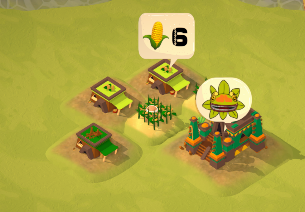
For 3D art, my task mainly lied in finding assets, and adjusting them to better fit the art-style of the game. For the houses, It was interesting to create small stories through the props found on them. We knew we wanted to increase the visual clarity of each building type through their detail colors, but by adding smaller details, I was able to add some character to each building type.
Near the end of the project it dawned on us just how important UI was to this game, a task which I quickly jumped on to perform. I was always interested in the concept of UI-UX design, designing the methods to guide players to perform certain actions through visual ques only. Sticking to visual aspects was even more evident here, as requested by the client that we should ensure keeping the least amount of text as possible.
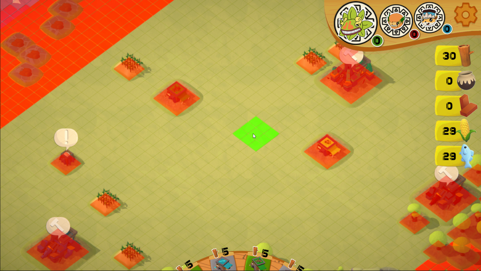
The goal of the UI was to use simple and big shapes, with repeating icons to create familiarity with the player. Such as the clickable icons in world to all have the same general shape and color, and resource icons being used in tributing and building having the same exact appearance as their HUD counterparts. I was free to create a larger scale HUD thanks to the fact that space was not required for play. Overall, I am quite proud how it turned out.

